
| Click on a book's image or title to order from Amazon.com |

How Buildings Learn
by Stewart BrandPenguin Books, TPB, © 1994, 229 pp, ISBN #0-14-013996-6
Reviewed January 1999
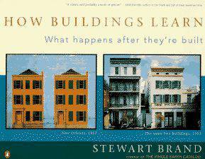
This book first caught my eye in a bookstore shortly after it was issued in paperback, mainly because of its fascinating graphics: The cover shows a watercolor painting of a couple of identical, side-by-side townhouses in New Orleans from 1857, juxtaposed with a photo of the same two buildings in 1993. One building has added a fourth floor and balconies on the second and third floors, but otherwise looks much the same as it had in 1857. The other has added a half-attic, and extension on one side, a first-floor commercial facade, and looks much more modernized than its companion.
Inside, the book contains many other examples of "rephotography", buildings and sites changing over the decades - and sometimes centuries - and some photos of building interiors (including the evolution of one room of a small company's workplace over the course of several years). Many of the photos are fascinating all by themselves.
The book's text expands on the photos to explore why buildings change over time, what forces pull at them, and how various kinds of buildings weather these changes. Make no mistake, though: How Buildings Learn is a manifesto about the American building, emphasizing the importance of making buildings functional and constructing them with an eye towards being able to adapt them as old tenants leave and new ones arrive, or as their long-term tenants' needs change. Brand decries "magazine architecture" which focuses primarily on aesthetics and interior design, and near-vilifies well-known architects as Frank Lloyd Wright and I. M. Pei as examples of architects who designed buildings to meet an aesthetic standard, and not to fulfill the roles they need to fulfill.
It's a thesis which I find very attractive, as my own inclinations tend to lean towards the functional first, aesthetic second: In my clothing, my living space, my working space. And the photos Brand presents tend to support his thesis by showing that buildings can have a beauty all their own, developed over the years as each new owner adds and subtracts to the structure. (He contrasts Pei's Media Lab at M.I.T. as a building which is incapable of adapting and only barely meets the needs of its inhabitants, to Building 20 on the same campus, which is much-beloved because it is infinitely flexible.)
The book also serves to some extent as a primer on thinking about architecture and construction, early on slicing building up into six layers according to how often they change: Site, Structure, Skin, Services, Space Plan, and Stuff. Stuff can be rearranged month-to-month, Services wear out every few decades, Structure is rarely changed, and the Site is eternal (until the next building comes along). Brand then examines different ways in which buildings change: "Low Road" buildings, such as basic commercial and industrial lots, change frequently and no one much cares when a new owner guts the place and completely reconfigures it - but good Low Road buildings are much in demand. "High Road" buildings are built to be fancy from the start (think European castles, for instance), but they, too, change over time, albeit usually in less radical ways.
Brand examines the history of certain styles of design, of the preservationist movement n the US, issues involved in the basic maintenance of buildings and of the materials used to construct and maintain them, and wraps up with some of his own thoughts on a way to revitalize the architecture business with an eye towards constructing buildings that can evolve and adapt.
The books is rarely less than fascinating, although towards the end it does get a bit slow as BRand reiterates conclusions which were amply considered in early chapters, and the photography is often stunning. A terrific book which was a joy to read.
hits since 13 August 2000.